Hello, thank you so much for your kind words :’) I made one graphic tutorial before (you can see it here). I will try to explain more about how I make my graphics and give some (hopefully) helpful tips!
This tutorial will show you how to achieve the above result. All of my examples will be caps, but the same methods can be used on gifs. There will be two methods shown, first with layers and then using curves and hue-sat. The latter is easier to use with gifs.
To close the big feature I made to the best fonts of 2014 here I bring you a big wall post of the 100 fonts in a form of a logotype, just as the designers have decided to display and promote their own typefaces.
Check the big list below and click the name you want:
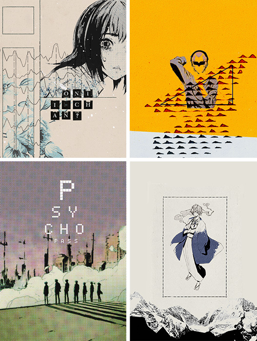
Here’s yet another pack for the lovely followers. Celebrating the second anniversary of this blog! I know there haven’t been as many psds out as the year before, but I refuse to let this blog die. So, here’s to hoping for another good year of psds.
Requested by @savvyingly. You will definitely need to adjust the layers, especially the color balance and selective coloring. Works best on cooler scenes inside of the Institute. Please like or reblog if you save this PSD.