i’m starting to hate the frequency of pinterest as a google result more than i hate pinterest itself. listen, google, googly-mate, pinterest isn’t a fuckign source. I want the sites those pictures came from because those are the ones with information such as dates, which is the entire point of the thing I am googling.
Damn right. How the hell am I supposed to find tutorials on how to do wire work or bead weaving when the first howevermany pages of Google results are some idiot’s cluster of Pinterest collections of those tutorials?
SOMEONE ELSE HATES PINTEREST AS MUCH AS I DO
not only does it fuck with sourcing images, but you can’t even SEE the images unless you have a ~pinterest account~ which I have zero interest in acquiring; it does this so completely adorable coy little thing where it shows you half the page and then when you scroll down it goes *complicated tiresome flower emoji face* JOIN PINTEREST 2 SEE MORE! *complicated tiresome flower emoji face* and my systolic reading spikes.
and google lists individual pinterest pages as separate results, so if a picture is popular, there can be HUNDREDS of pinterest listings before you find anything you could possibly trace back to a source.
listen, all my art bros who are mad about people not sourcing art, i dig that, i agree that sourcing is important, but maybe stop saying reverse image search is easy or ‘30 seconds’ or whatever. sometimes it’s just straight up impossible because fucking pinterest ruins everything.
SUPER EASY WAY TO AVOID PINTEREST: type your query and then -pinterest
7 of the first 12 results are from pinterest
zero items from pinterest not a single one I’m free
Reblog to save a set of nerves.
I use an extension called personal blocklist – when you search google for something, what site the result is from is listed underneath each search result and all you have to go is click “block pinterest/weheartit/giphy” whatever and those results get filtered out every time you search after that:
with pinterest blocked, this is what happens if you search pinterest (and also if you reverse image search anything):
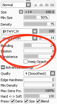
I’ve had a general idea what these things did but wasn’t completely sure what their specific functions were. I decided to sit down and figure it out, and I have thrown together a short reference guide for anyone who is confused about them. I know there are multiple translations of SAI floating around, so if some of these terms don’t sound familiar, just know that I’m talking about the three settings that appear under the texture in the brush tool settings (note that this won’t apply to any tool types except for brushesand watercolor brushes).
I don’t claim to be an expert so if you find I’ve made a mistake, let me know so I can update it, thanks! :3
—-
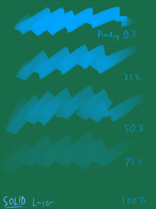
BLENDING (Color Blending)
This controls how readily the brush will inherit any colors you are painting over with it. For example, a 0% blending setting will pick up no existing colors, treating it as if you were painting on a transparent layer. A 100% blending setting will ONLY pick up existing colors (provided there are any). So at 100%, the color you’re using won’t even show up, unless you move to a transparent area. Blending is not affected by transparent pixels, so if you’re drawing on a blank layer it will have no effect.
So you can see from this example that the color I’m using gets harder to paint as the blending increases and more of the existing green is absorbed, until at 100% it is just completely turning green.
—-
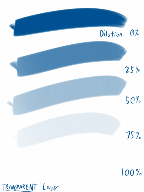
DILUTION (Opacity Mix)
This controls how readily the brush will draw on a blank (transparent) part of the layer. A 0% Dilution will result in the brush painting very easily onto a blank surface, while a brush with 100% dilution will literally not paint on blank parts of the layer at all. Dilution is ONLY affected by transparent pixels. So it won’t do anything if the whole layer is already filled in (even with white). Dilution can be thought of as the inverse of the Blending setting in some ways.
So in this example, you can see that as dilution approaches 100%, the color I’m painting with basically becomes invisible. In fact, if you were to switch to binary color mode and look at this layer, there would literally be nothing there anymore!
Keep this in mind – if you ever can’t paint for some reason, check your dilution setting, it might have gotten accidentally bumped to 100!
—-
PERSISTENCE
This one goes hand-in-hand with blending. Basically, it controls how easily a brush shifts color as you are blending from one color to another. Rather, how long it “persists” if you will. Like blending, Persistence is only really relevant when painting over existing color so it’s mostly unaffected by transparent pixels. Basically, the higher the persistence, the longer it will take for the color to shift as you make a stroke, and subsequently, from which color to which other color it is shifting is dependent on the blending setting.
So for this example I’ve done the same test with three different levels of blending. I turned off all pressure sensitivity (actually I just used my mouse) to emphasize the effects in a controlled environment:
If blending is at 0%, persistence fails to have any real effect. With pressure on, there is only the difference of having to push harder, but the results will be the same as far as I can tell.
At a happy medium of 50%, persistence increase causes the orange that the brush is picking up to last longer as it goes into the green, until it never shifts to blue at all.
At 100% blending, there was never any blue in the first place, because as we already know, full blending causes you to only pick up existing color. So the persistence setting changes only how fast the orange changes to green.
Persistence is dependent upon the blending settings, so having them somewhere in the middle will probably produce the most optimal results.
—-
CONCLUSION
Ultimately how you use these is up to you, and is largely dependent on what kind of brush you’re making and what it will be used for. And most of these settings are meant to be used together in unison, so play around with them a lot!
If you are confused, or not sure what settings you want or what settings you should be using, a safe bet is to put them all at about 50% – that will produce fairly average results that are easy to work with, and it’s easy to remember in case you want to experiment but don’t want to forget your settings in case you decide to switch back.
I just commented this on a transphobic post that was all like, “In a sexual species, females have two X chromosomes and males have an X and a Y, I’m not a bigot it’s just science.” I’m a science teacher so I responded with this.
First of all, in a sexual species, you can have females be XX and males be X (insects), you can have females be ZW and males be ZZ (birds), you can have females be females because they developed in a warm environment and males be males because they developed in a cool environment (reptiles), you can have females be females because they lost a penis sword fighting contest (some flatworms), you can have males be males because they were born female, but changed sexes because the only male in their group died (parrotfish and clownfish), you can have males look and act like females because they are trying to get close enough to actual females to mate with them (cuttlefish, bluegills, others), or you can be one of thousands of sexes (slime mold, some mushrooms.) Oh, did you mean humans? Oh ok then. You can be male because you were born female, but you have 5-alphareductase deficiency and so you grew a penis at age 12. You can be female because you have an X and a Y chromosome but you are insensitive to androgens, and so you have a female body. You can be female because you have an X and a Y chromosome but your Y is missing the SRY gene, and so you have a female body. You can be male because you have two X chromosomes, but one of your X’s HAS an SRY gene, and so you have a male body. You can be male because you have two X chromosomes- but also a Y. You can be female because you have only one X chromosome at all. And you can be male because you have two X chromosomes, but your heart and brain are male. And vice – effing – versa. Don’t use science to justify your bigotry. The world is way too weird for that shit.
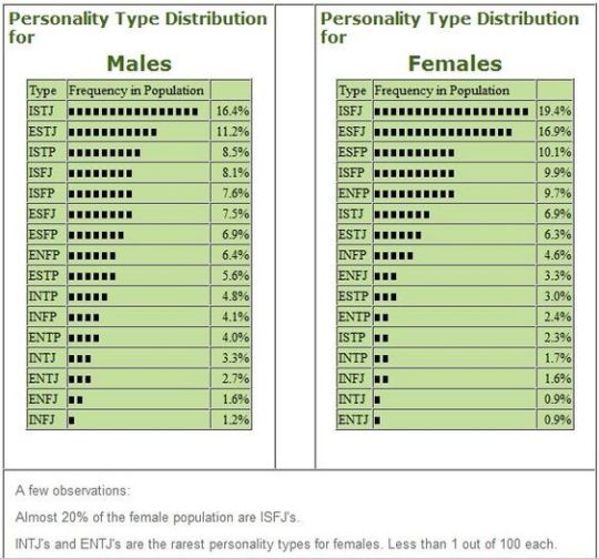
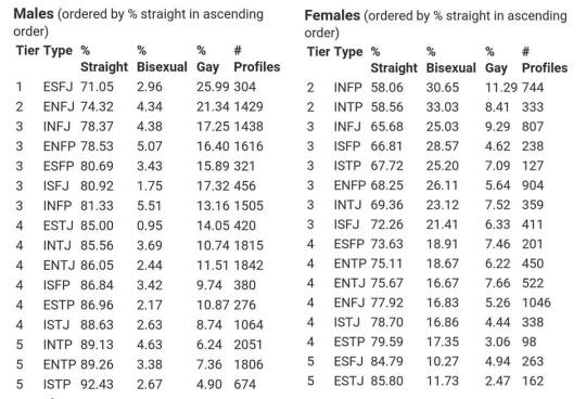
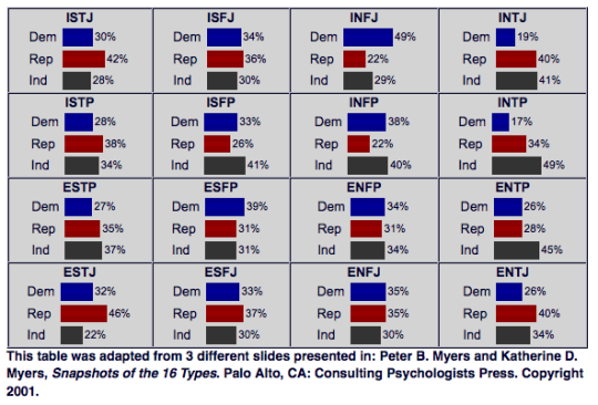
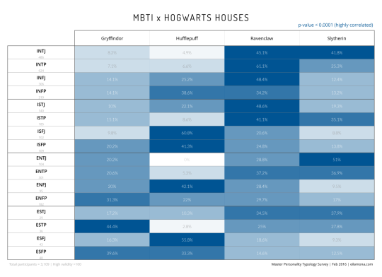
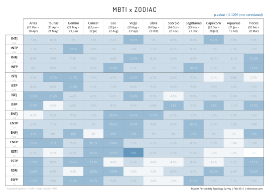
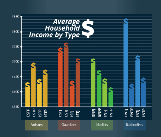
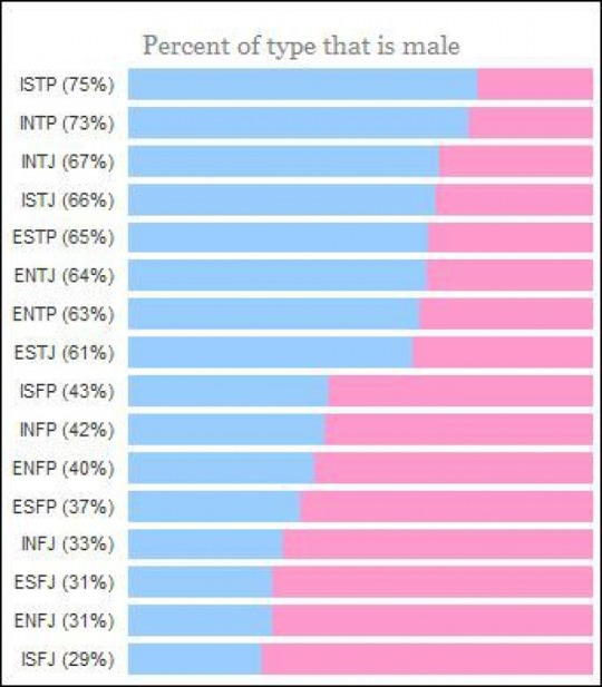
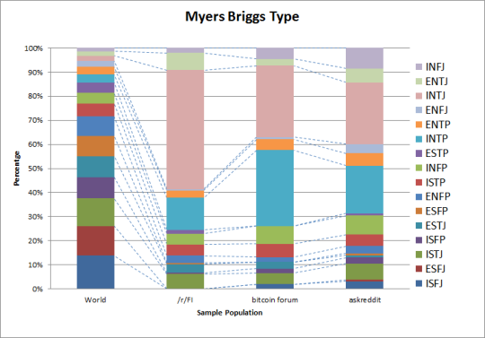
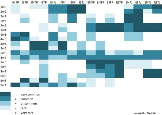
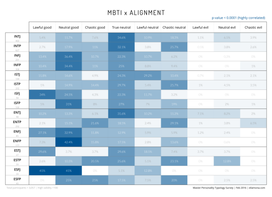
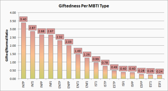
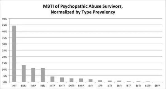
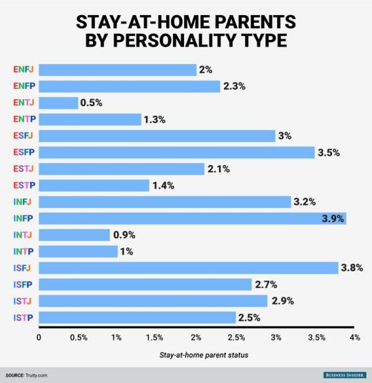
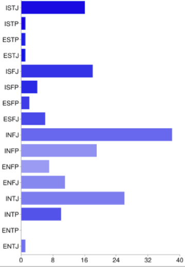
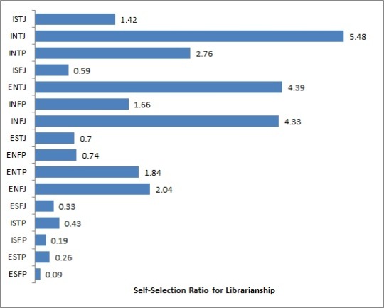
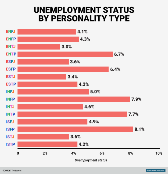
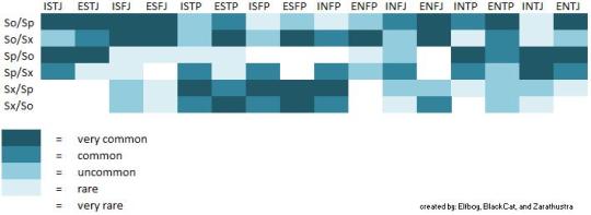
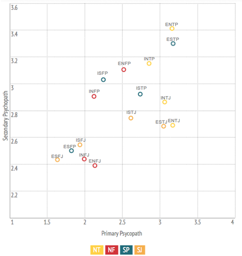
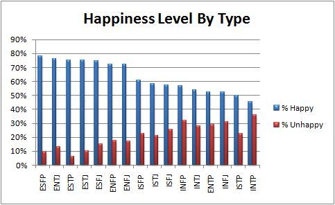
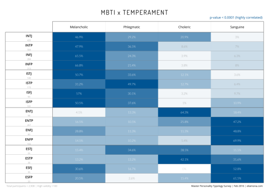
Have you ever been bored on a Tuesday evening just sitting around and thinking to yourself, “Boy, I sure wish I had a shit ton of random MBTI-related charts, statistics, and surveys to look at”? SAY NO MORE, FAM. I have compiled here for you today the world’s finest assortment of completely useless MBTI-related data, all for your viewing (and procrastinating) pleasure. Enjoy!
Character design and drawing are tome-sized topics and even if I had all the answers (I don’t – I have a lot to learn), I’m not sure I could communicate them effectively. I’ve gathered some thoughts and ideas here, though, in case they’re helpful.
First, some general things:
– Relax and let some of that anxiety go. This isn’t a hard science. There’s no wrong way, no rigid process you must adhere to, no shoulds or shouldn’ts except those you designate for yourself. This is one of the fun parts of being an artist, really – have a heady good time with it.
– Be patient. A design is something gradually arrived at. It takes time and iteration and revision. You’ll throw a lot of stuff away, and you’ll inevitably get frustrated, but bear in mind the process is both inductive and deductive. Drawing the wrong things is part of the path toward drawing the right thing.
– Learn to draw. It might seem perfunctory to say, but I’m not sure everyone’s on the same page about what this means. Learning to draw isn’t a sort of rote memorization process in which, one by one, you learn a recipe for humans, horses, pokemon, cars, etc. It’s much more about learning to think like an artist, to develop the sort of spacial intelligence that lets you observe and effectively translate to paper, whatever the subject matter. When you’re really learning to draw, you’re learning to draw anything and everything. Observing and sketching trains you to understand dimension, form, gesture, mood, how anatomy works, economy of line; all of the foundational stuff you will also rely on to draw characters from your imagination. Spend some time honing your drawing ability. Hone it with observational sketching. Hone it good.
I don’t think I’ve ever seen anyone do this sort of thing better than Claire Wendling. In fact, character designs emerge almost seamlessly from her gestural sketches. It’d be worth looking her up.
– Gather Inspiration like a crazed magpie. What will ultimately be your trademark style and technique is a sort of snowball accumulation of the various things you expose yourself to, learn and draw influence from. To that effect, Google images, tumblr, pinterest and stock photo sites are your friends. When something tingles your artsy senses – a style, a shape, a texture, an appealing palette, a composition, a pose, a cool looking animal, a unique piece of apparel, whatever – grab it. Looking at a lot of material through a creative lens will make you a better artist the same way reading a lot of material makes a better writer. It’ll also devour your hard drive and you will try and fail many times to organize it, but more importantly, it’ll give you a lovely library of ideas and motivational shinies to peruse as you’re conjuring characters.
– Imitation is a powerful learning tool. Probably for many of us, drawing popular cartoon characters was the gateway habit that lured us into the depraved world of character design to begin with. I wouldn’t suggest limiting yourself to one style or neglecting your own inventions to do this, but it’s an effective way to limber up, to get comfortable drawing characters in general, and to glean something from the thought processes of other artists.
– Use references. Don’t leave it all up to guessing. Whether you’re trying to design something with realistic anatomy or something rather profoundly abstracted from reality, it’s helpful in a multitude of ways to look at pictures. When designing characters, you can infer a lot personality from photos, too.
And despite what you might have heard, having eyeballs and using them to look at things doesn’t constitute cheating. There’s no shame in reference material. There’s at least a little shame in unintentional abstractions, though.
Concepts and Approach:
– Break it down. Sometimes you have the look of a character fleshed out in your mind before putting it to paper, but usually not. That doesn’t mean you have to blow your cortical fuses trying conceive multiple diverse designs all at the same time, though. You don’t even have to design the body shape, poses, face, and expressions of a single character all at once. Tackle it a little at a time.
The cartoony, googly eyed style was pre-established for this simple mobile game character, but I still broke it into phases. Start with concepts, filter out what you like until you arrive at a look, experiment with colors, gestures and expressions.
– Start with the general and work toward the specific. Scribbling out scads of little thumbnails and silhouettes to capture an overall character shape is an effective way begin – it’s like jotting down visual notes. When you’re working at a small scale without agonizing over precision and details, there’s no risk of having to toss out a bunch of hard work, so go nuts with it. Give yourself a lot of options.
Here’s are some sample silhouettes from an old cancelled project in which I was tasked with designing some kind of cyber monkey death bot. I scratched out some solid black shapes then refined some of them a step or two further.
– Shapes are language. They come preloaded with all sorts of biological, cultural and personal connotations. They evoke certain things from us too. If you’re ever stuck about where to go with your design, employ a sort of anthroposcopy along these lines – make a visual free association game out of it. It’ll not only tend to result in a distinguished design, but a design that communicates something about the nature of the character.
Think about what you infer from different shapes. What do they remind you of? What personalities or attitudes come to mind? How does the mood of a soft curve differ from that of a sharp angle? With those attributes attached, how could they be used or incorporated into a body or facial feature shape? What happens when you combine shapes in complementary or contrasting ways? How does changing the weight distribution among a set of shapes affect look and feel? Experiment until a concept starts to resonate with the character you have in mind or until you stumble on something you like.
If you don’t have intent, take the opposite approach – draw some shapes and see where they go. (It’s stupid fun.)
– Cohesion and Style. As you move from thumbnails to more refined drawings, you can start extrapolating details from the general form. Look for defining shapes, emergent themes or patterns and tease them out further, repeat them, mirror them, alternate them. Make the character entirely out of boxy shapes, incorporate multiple elements of an architectural style, use rhythmically varying line weights – there are a million ways to do this
Here’s some of the simple shape repetition I’ve used for Lackadaisy characters.
– Expressions – let them emerge from your design. If your various characters have distinguishing features, the expressions they make with those features will distinguish them further. Allow personality to influence expressions too, or vice versa. Often, a bit of both happens as you continue drawing – physiognomy and personality converge somewhere in the middle.
For instance, Viktor’s head is proportioned a little like a big cat. Befitting his personality, his design lets him make rather bestial expressions. Rocky, with his flair for drama, has a bit more cartoon about him. His expressions are more elastic, his cheeks squish and deform and his big eyebrows push the boundaries of his forehead. Mitzi is gentler all around with altogether fewer lines on her face. The combination of her large sleepy eyes and pencil line brow looked a little sad and a little condescending to me when I began working out her design – ultimately those aspects became incorporated into her personality.
I discuss expression drawing in more detail here (click the image for the link):
– Pose rendering is another one of those things for which observational/gesture drawing comes in handy. Even if you’re essentially scribbling stick figures, you can get a handle on natural looking, communicative poses this way. Stick figure poses make excellent guidelines for plotting out full fledged character drawings too.
Look for the line of action. It’ll be easiest to identify in poses with motions, gestures and moods that are immediately decipherable. When you’ve learned to spot it, you can start reverse engineering your own poses around it.
– Additional resources – here are some related things about drawing poses and constructing characters (click the images for the links).
Lastly…
– Tortured rumination about lack of ability/style/progress is a near universal state of creative affairs. Every artist I have known and worked with falls somewhere on a spectrum between frustration in perpetuity and a shade of fierce contrition Arthur Dimmesdale would be proud of. So, next time you find yourself constructing a scourge out of all those crusty acrylic brushes you failed to clean properly, you loathsome, deluded hack, you, at least remember you’re not alone in feeling that way. When it’s not crushing the will to live out of you, the device does have its uses – it keeps you self-critical and locked in working to improve mode. If we were all quite satisfied with our output, I suppose we’d be out of reasons to try harder next time.
When you need some reassurance, compare old work to new. Evolution is gradual and difficult to perceive if you’re narrowed in on the nearest data point, but if you’ve been steadily working on characters for a few months or a year, you’ll likely see a favorable difference between points A and B.
Most of all, don’t dwell on achieving some sort of endgame in which you’re finally there as a character artist. There’s no such place – wherever you are, there is somewhere else. It’s a moving goal post. Your energy will be better spent just enjoying the process…and that much will show in the results.
My super advanced mapmaking technique – a handful of dice makes the map nice
interesting method
My question is do the die affect topography any or just set the borders?
I imagine it’s up to the person making the map. But maybe the more dice in a single spot, the more mountainous or forested the area. Maybe choose a few dice to be deemed cities, and some dice for ruins.
Maybe let the dice choose, like a nat 20 would be the world capital, and 10’s would be mountains or something like that.
1-5: Plains and fields
6-8: Forests
9-11: Mountains
12-14: Tundras and snow covered lands
15-17: Farms and towns
18-19: Larger cities
20: Capitals and castles
what would happing if all the dice landed on a 20?
then you have a very busy continent
not all of those are d20s though, so you’d have to come up with another method for the other ones
Adjusted for all dice you might have
D20
1-5: Plains and fields
6-8: Forests
9-11: Mountains
12-14: Tundras and snow covered lands
15-17: Farms and towns
18-19: Larger cities
20: Capitals and castles
D12
1-3: Plains and fields
4-6: Forests
7-8: Mountains
9-10: Tundras and snow covered lands
11: Farms and towns
12: Larger cities
D10
1-3: Plains and fields
4-6: Forests
7-8: Mountains
9: Tundras and snow covered lands
10: Farms and towns
D8
1-4: Plains and fields
5-6: Forests
7: Mountains
8: Tundras and snow covered lands
D6
1-3: Plains and fields
4: Forests
5-6: Mountains
D4
1-2: Plains and fields
3: Forests
4: Mountains
Holy shit. Definitely using this.
I swore at how simple this motherfucking thing is. You’re all bastards and i love you.
“If you take it longer than 30 minutes, you end up in deep sleep. Have you ever taken a nap and felt worse when you woke up? That’s what’s happening — you’re sleeping too long and you’re going into a stage of sleep that’s very difficult to get out of.” [x]
Sleep inertia is a physiological state characterized by a decline in motor dexterity and a subjective feeling of grogginess immediately following an abrupt awakening. The impaired alertness may interfere with the ability to perform mental or physical tasks. Sleep inertia can also refer to the tendency of a person wanting to return to sleep.
Studies by the Human Factors Division at NASA Ames Research Center have shown that a variety of factors influence the severity and duration of sleep inertia. One includes:
Depth of sleep when awakened. After roughly 30 minutes, the brain enters into slow-wave sleep (deep sleep). Being awakened during this stage yields more sleep inertia than awakening from other stages of sleep. However, since one cannot predict accurately the stages of sleep that will occur within a nap, there is no physiological reason to try to limit the length of a nap. When one is sleep deprived, any sleep is good.